Intro
We are going to develop the UI for a landing page for a new product, called "Recipe Search". It will be a search page for recipes. The user will be able to search for recipes by name, ingredients, or cooking method. The results will be displayed in a list. The user will be able to click on a recipe to see the full recipe. The user will be able to click on the "Add to Favorites" button to add the recipe to their favorites.
We are going to try to follow this Dribbble https://dribbble.com/shots/13671297-Recipes and have the ability to showcase the beautiful photography from our photojournalists.
The source code for this guide is available on The Washington Post GitHub github.com/washingtonpost/wpds-coding-a-page-guide.
Prerequisites
This guide assumes you have a Next.js project set up and have completed the React Guide.
Takeaways
You will finish this tutorial with a strong opinion from us on how to best develop a page using the UI Kit. We will discuss the following:
- Page Layout
- UI Component Organization
- Component Variants
Page Layout
We are going to have two layouts one for smaller screens and one for larger screens. Luckily, today we have CSS Grid & Flex Box. We will be using these to create our layouts. On small screens, the recipe when opened will display on top of the search results. On larger screens, the recipe will be displayed to the right of the search results, the search results will be displayed to the left of the recipe in 4 columns.
Container
import React from "react";
import { Container, styled, theme } from "@washingtonpost/wpds-ui-kit";
const StyledContainer = styled(Container, {
backgroundColor: theme.colors["blue600"],
minHeight: "100vh",
});
export default function Home() {
return <StyledContainer>Container</StyledContainer>;
}
WPDS ships with a responsive Container component that centers its content and resizes based on window width. It has four sizes based on UI Kit's internal breakpoints. For small and medium breakpoints the container's width is 100%, large is 900px, extra large and extra extra large is 1024px, and above extra large is 1440px. In the initial stage of developing the layout, we'll use the stitches styled function that ships with UI Kit to make the container easier to visualize.
Structural Elements
import React from "react";
import { Container, styled, theme } from "@washingtonpost/wpds-ui-kit";
const StyledContainer = styled(Container, {
alignItems: "unset",
backgroundColor: theme.colors["blue600"],
gap: theme.space["100"],
minHeight: "100vh",
padding: theme.space["100"],
"& > :nth-child(2)": {
flex: 1,
},
});
const Header = styled("header", {
backgroundColor: theme.colors["blue400"],
padding: theme.space["050"],
});
const OverviewDetail = styled("div", {
display: "flex",
gap: theme.space["100"],
});
const Overview = styled("div", {
backgroundColor: theme.colors["blue400"],
flex: "1",
padding: theme.space["050"],
});
const Detail = styled("div", {
backgroundColor: theme.colors["blue400"],
flex: "0 25%",
padding: theme.space["050"],
});
export default function Home() {
return (
<StyledContainer>
<Header>Header</Header>
<OverviewDetail>
<Overview>Overview</Overview>
<Detail>Detail</Detail>
</OverviewDetail>
</StyledContainer>
);
}
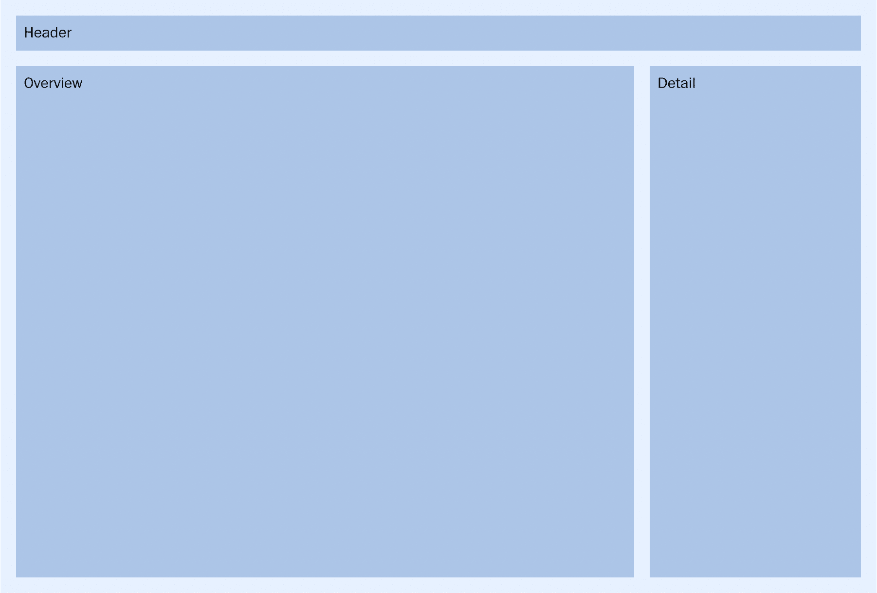
The layout's structural elements
By default, Container is set to display flex with a direction of column. Our layout adds two children. A Header component contains elements that span the width of the page and an OverviewDetail component contains the grid of recipe photos and the selected recipe's details. StyledContainer un-sets alignItems to allow its child elements to have a 100% width. It also sets a flex property of 1 on OverviewDetail using an nth-child selector to allow it to expand and fill any vertical space not occupied by the Header. Using a child selector keeps OverviewDetail separated from the concern of how it is layed out in its parent.
The OverviewDetail has its display property set to flex to layout its child elements in a row. The Overview element also uses flex: 1 to expand and fill the main portion of OverviewDetail's flex row. Finally, the Detail element starts in its large screens layout, using flex's two value syntax to set its width to 25%.
Adding Responsiveness
In the proposed layout Details responds to screen size changes and will display as an overlay on smaller screen sizes. We'll use a combination of variants and breakpoints in stitches to achieve this.
...
const Detail = styled("div", {
backgroundColor: theme.colors["blue400"],
padding: theme.space["050"],
variants: {
layout: {
column: {
flex: "0 0 25%",
},
overlay: {
inset: 0,
overflow: "auto",
opacity: 0.75,
position: "fixed",
zIndex: theme.zIndices.offer,
},
},
},
});
...
<Detail
layout={{
"@initial": "column",
"@sm": "overlay",
}}
>
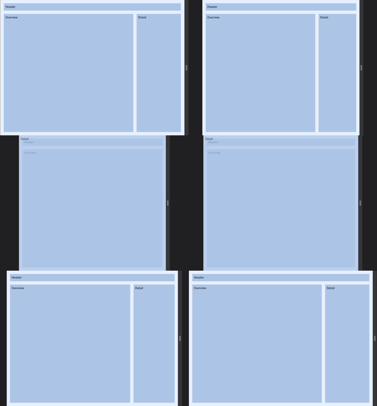
Detail's responsiveness
Stitches supports responsive styles by allowing variants to be applied at different breakpoints. The UI Kit stitches config contains a media object with 5 breakpoints, sm, md, lg, xl, xxl as well as the inverses notSm, notMd, notLg, notXl.
To selectively apply a style a prop with the parent variant name on the element is passed an object that contains keys of breakpoint names and values of child variant names. An initial variant can be set by using the @initial key.
With this method, the Detail pane initially uses the "column" layout but at the small breakpoint switches to the "overlay" layout.
Responsive Grid
...
const ResponsiveGrid = styled("ul", {
display: "grid",
gap: theme.space["050"],
listStyle: "none",
marginBlock: theme.space["050"],
paddingInlineStart: "0",
variants: {
layout: {
twoColumn: {
gridTemplateColumns: "repeat(2, minmax(50px, 1fr))",
},
fourColumn: {
gridTemplateColumns: "repeat(4, minmax(50px, 1fr))",
},
},
},
});
const ResponsiveGridItem = styled("li", {
backgroundColor: theme.colors["blue300"],
padding: theme.space["050"],
});
...
<ResponsiveGrid
layout={{
"@initial": "fourColumn",
"@sm": "twoColumn",
}}
>
{recipes.map((recipe, index) => (
<ResponsiveGridItem key={index}>{index}</ResponsiveGridItem>
))}
</ResponsiveGrid>
By using the same approach to responsiveness we can create a grid for recipes that switches between a two and a four column layout. CSS grid layout takes care of managing the display of the desired number of columns using the repeat function. Rows aren't templated and implicitly repeat with auto sizing.
Show and Hide Details
...
const [selectedRecipe, setSelectedRecipe] = React.useState();
function handleCloseClick() {
setSelectedRecipe(undefined);
}
function handleRecipeClick(id) {
setSelectedRecipe(id);
}
...
<ResponsiveGridItem
key={index}
onClick={() => handleRecipeClick(index)}
>
{index}
</ResponsiveGridItem>
...
{selectedRecipe !== undefined && (
<Detail
layout={{
"@initial": "column",
"@sm": "overlay",
}}
>
Detail
<br />
{selectedRecipe}
<CloseButton onClick={handleCloseClick}>Close</CloseButton>
</Detail>
)}
To complete a basic version of the required interactivity we'll add a selectedRecipe state that is set whenever a grid element is clicked. The detail pane is then conditionally rendered only after a recipe is selected. The close button clears the selectedRecipe removing the detail pane.
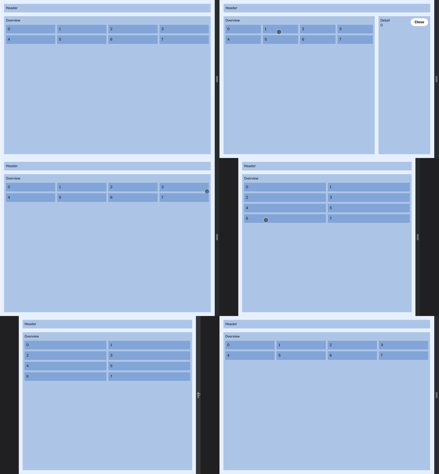
Complete interactive layout, showing the responsive grid and opening and closing details
Adding Data
To keep this guide self-contained we will be working with a local data source, but the approach for interacting with an API will be similar in a production environment.
...
import useSWR from "swr";
...
const fetcher = (...args) => fetch(...args).then((res) => res.json());
...
const { data: recipes } = useSWR(() => `/api/recipes?search=`, fetcher);
To fetch data we use Next's recommended sibling helper library SWR and replace the previously empty recipes array with real data from the local api endpoint.
The endpoint returns a JSON array of recipe objects with the following fields.
[
  {
    id
    title
    image
    ingredients
    instructions
  }
]
Which can then be used to populate the grid and the details pane.
Searching
const [searchText, setSearchText] = React.useState("");
const debouncedSearchText = useDebounce(searchText, 275);
const { data: recipes } = useSWR(
() => `/api/recipes?search=${debouncedSearchText}`,
fetcher
);
function handleSearchChange(event) {
setSearchText(event.target.value);
}
...
<Header>
Recipe Search
<InputText
type="search"
label="Search"
name="search-input"
id="search-input"
value={searchText}
onChange={handleSearchChange}
/>
</Header>
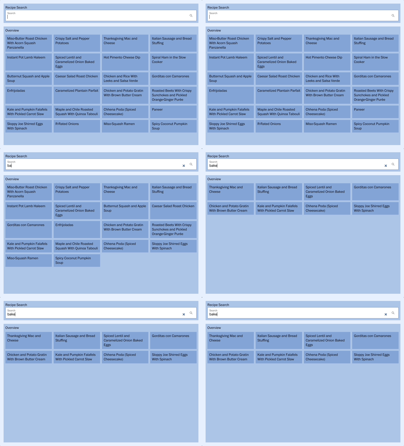
With the addition of a search input field, any user-entered text can be stored in state and used to update the API request. By passing a function to SWR it will make use of a dynamic value to re-fetch data on changes. In addition, a debounced value from a utility hook is used to ensure that the search text value does not change until the user has paused typing.
UI Component Organization
Up until this point all of our development has occurred in the index.js file. As we finalize the development of the page it's useful to abstract out each of these custom elements as stand-alone component files. Keeping our index file clear, performant, and focused on its primary responsibility of handling data and state.
Next expects components to be located in a top-level folder. Let's move our elements to files in that folder and refactor out the temporary styles we used to visualize them. During refactoring, we'll favor flow relative logical properties to handle any possible direction or orientation changes.
Then we'll add a couple of additional components to properly display the recipes.
Styled Element Wrappers
Header
import { styled, theme } from "@washingtonpost/wpds-ui-kit";
const Header = styled("header", {
paddingBlockStart: theme.space["500"],
paddingBlockEnd: theme.space["100"],
});
export { Header };
PageHeading
import { styled, theme } from "@washingtonpost/wpds-ui-kit";
const PageHeading = styled("h1", {
color: theme.colors.primary,
fontFamily: theme.fonts.headline,
fontSize: theme.fontSizes["300"],
marginBlockEnd: theme.space["100"],
});
export { PageHeading };
ResponsiveGrid
import { styled, theme } from "@washingtonpost/wpds-ui-kit";
const Grid = styled("ul", {
display: "grid",
gap: theme.space["050"],
listStyle: "none",
paddingInlineStart: "0",
variants: {
layout: {
twoColumn: {
gridTemplateColumns: "repeat(2, minmax(50px, 1fr))",
},
fourColumn: {
gridTemplateColumns: "repeat(4, minmax(50px, 1fr))",
},
},
},
});
const ResponsiveGrid = ({ children, ...props }) => {
return (
<Grid
{...props}
layout={{
"@initial": "fourColumn",
"@sm": "twoColumn",
}}
>
{children}
</Grid>
);
};
const ResponsiveGridItem = styled("li", {});
export { ResponsiveGrid, ResponsiveGridItem };
The Header, PageHeading, and ResponsiveGrid components end up as simple wrappers around their styled elements. All the components favor named exports over default exports. The ResponsiveGrid also exports a ResponsiveGridItem. These components have an explicit parent-child relationship so they share the same file.
OverviewDetail
import {
Button,
Divider,
Icon,
styled,
theme,
} from "@washingtonpost/wpds-ui-kit";
import { Close } from "@washingtonpost/wpds-assets";
const OverviewDetail = styled("div", {
display: "flex",
});
const Overview = styled("div", {
flex: "1",
});
const DetailContainer = styled("div", {
display: "flex",
position: "relative",
variants: {
layout: {
column: {
flex: "0 0 25%",
},
overlay: {
backgroundColor: theme.colors.secondary,
inset: 0,
overflow: "auto",
position: "fixed",
zIndex: theme.zIndices.offer,
},
},
},
});
const CloseButton = styled(Button, {
position: "absolute",
insetBlockStart: theme.space["050"],
insetInlineEnd: theme.space["050"],
});
const StyledDivider = styled(Divider, {
marginInline: theme.space["100"],
paddingInlineStart: "1px",
variants: {
layout: {
hidden: {
display: "none",
},
},
},
});
const Detail = ({ children, onClose, ...props }) => {
if (!children) {
return null;
}
return (
<DetailContainer
{...props}
layout={{
"@initial": "column",
"@sm": "overlay",
}}
>
<CloseButton variant="primary" icon="center" onClick={() => onClose()}>
<Icon label="Close">
<Close />
</Icon>
</CloseButton>
<StyledDivider
orientation="vertical"
decorative
layout={{
"@sm": "hidden",
}}
/>
{children}
</DetailContainer>
);
};
export { OverviewDetail, Overview, Detail };
OverviewDetail has some additional responsibilities in the Detail component. If no children are passed it won't render, facilitating its show hide functionality. It also now contains a conditionally rendered divider that is hidden when it displays as an overlay.
Recipe Components
Recipe Card
import { Button, Icon, styled, theme } from "@washingtonpost/wpds-ui-kit";
import { Like, LikeSolid } from "@washingtonpost/wpds-assets";
import { useLocalStorage } from "../hooks/use-local-storage";
const Card = styled("div", {
display: "grid",
gridTemplateAreas: `"img img"
"title fav"`,
gridTemplateColumns: `1fr ${theme.space["200"]}`,
gridTemplateRows: "auto",
alignItems: "center",
position: "relative",
gap: theme.space["025"],
});
const Image = styled("img", {
display: "block",
gridArea: "img",
width: "100%",
});
const Title = styled("span", {
fontFamily: theme.fonts.subhead,
fontWeight: theme.fontWeights.bold,
color: theme.colors.primary,
paddingInlineStart: theme.space["025"],
whiteSpace: "nowrap",
overflow: "hidden",
textOverflow: "ellipsis",
gridArea: "title",
});
const TransparentButton = styled("button", {
backgroundColor: "transparent",
border: "none",
cursor: "pointer",
position: "absolute",
inset: 0,
zIndex: 1,
"&:focus": {
outline: "1px solid $signal",
},
});
const FavoriteButton = styled(Button, {
gridArea: "fav",
position: "relative",
zIndex: 2,
"& *": {
pointerEvents: "none",
},
});
const RecipeCard = ({ content, onClick }) => {
const [isFavorite, setIsFavorite] = useLocalStorage(
`recipeFavorite${content.id}`,
false
);
function handleFavoriteClick(event) {
setIsFavorite((prevFavorite) => !prevFavorite);
}
return (
<Card>
<TransparentButton
onClick={onClick}
title={`See the full recipe for ${content.title}`}
/>
<Image src={`/img/${content.image}.jpg`} alt="" />
<Title title={content.title}>{content.title}</Title>
<FavoriteButton
variant="primary"
isOutline
css={{ border: "none" }}
icon="center"
onClick={handleFavoriteClick}
>
{isFavorite ? (
<Icon
size="100"
fill={theme.colors.red200}
label="Remove from favorites"
>
<LikeSolid />
</Icon>
) : (
<Icon size="100" label="Add to favorites">
<Like />
</Icon>
)}
</FavoriteButton>
</Card>
);
};
export { RecipeCard };
The RecipeCard contains an image, title, and favorite toggle button. It uses css grid and the UI Kit spacing constants to arrange these elements. With both the card as well as the favorites toggle being clickable it's necessary to include an invisible button as a sibling for both elements to remain interactive and accessible. Finally, a local storage hook is used to store any clicked favorites and persist them between visits.
Recipe
import { styled, theme } from "@washingtonpost/wpds-ui-kit";
const Container = styled("div", {
color: theme.colors.primary,
padding: theme.space["100"],
});
const HeaderImage = styled("img", {
display: "block",
width: "100%",
});
const MainHeading = styled("h2", {
marginBlockEnd: theme.space["050"],
fontFamily: theme.fonts.subhead,
});
const SectionHeading = styled("h3", {
marginBlockEnd: theme.space["050"],
fontFamily: theme.fonts.subhead,
fontSize: theme.fontSizes["087"],
textTransform: "uppercase",
});
const IngredientList = styled("ul", {
marginBlockEnd: theme.space["050"],
paddingInlineStart: theme.space["100"],
fontFamily: theme.fonts.body,
});
const Directions = styled("p", {
fontFamily: theme.fonts.body,
});
const Recipe = ({ content }) => {
return (
<div>
<HeaderImage src={`/img/${content.image}.jpg`} alt="" />
<Container>
<MainHeading>{content.title}</MainHeading>
<SectionHeading>Ingredients</SectionHeading>
<IngredientList>
{content.ingredients
.substring(2, content.ingredients.length - 2)
.split("', '")
.map((ingredient) => (
<li key={ingredient}>{ingredient}</li>
))}
</IngredientList>
<SectionHeading>Directions</SectionHeading>
<Directions>{content.instructions}</Directions>
</Container>
</div>
);
};
export { Recipe };
the Recipe component is a straightforward display of the recipe's image and text content broken out by type. A small bit of logic is used for parsing ingredients into a list.
Final Page
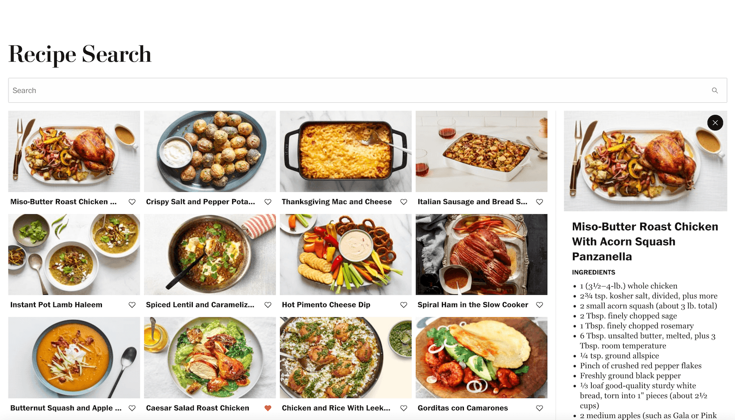
The final layout
import React from "react";
import Head from "next/head";
import useSWR from "swr";
import { Container, InputText, styled } from "@washingtonpost/wpds-ui-kit";
import { Header } from "../components/header";
import { PageHeading } from "../components/page-heading";
import {
OverviewDetail,
Overview,
Detail,
} from "../components/overview-detail";
import {
ResponsiveGrid,
ResponsiveGridItem,
} from "../components/responsive-grid";
import { RecipeCard } from "../components/recipe-card";
import { Recipe } from "../components/recipe";
import { useDebounce } from "../hooks/use-debounce";
const StyledContainer = styled(Container, {
alignItems: "unset",
minHeight: "100vh",
"& > :nth-child(2)": {
flex: 1,
},
});
const fetcher = (...args) => fetch(...args).then((res) => res.json());
export default function Home() {
const [searchText, setSearchText] = React.useState("");
const debouncedSearchText = useDebounce(searchText, 275);
const { data: recipes = [] } = useSWR(
() => `/api/recipes?search=${debouncedSearchText}`,
fetcher
);
const [selectedRecipe, setSelectedRecipe] = React.useState();
function handleCloseClick() {
setSelectedRecipe(undefined);
}
function handleRecipeClick(id) {
const selected = recipes.find((recipe) => recipe.id === id);
setSelectedRecipe(selected);
}
function handleSearchChange(event) {
setSearchText(event.target.value);
}
return (
<StyledContainer>
<Head>
<title>Recipe Search</title>
</Head>
<Header>
<PageHeading>Recipe Search</PageHeading>
<InputText
type="search"
label="Search"
name="search-input"
id="search-input"
value={searchText}
onChange={handleSearchChange}
/>
</Header>
<OverviewDetail role="main">
<Overview>
<ResponsiveGrid>
{recipes.map((recipe, index) => (
<ResponsiveGridItem key={recipe.id}>
<RecipeCard
onClick={() => handleRecipeClick(recipe.id)}
content={recipe}
/>
</ResponsiveGridItem>
))}
</ResponsiveGrid>
</Overview>
<Detail onClose={handleCloseClick}>
{selectedRecipe !== undefined && <Recipe content={selectedRecipe} />}
</Detail>
</OverviewDetail>
</StyledContainer>
);
}
Bonus: Adding Animation
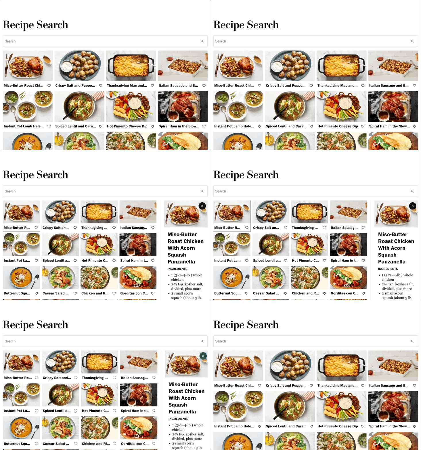
Animated opening and closing details
const OverviewDetail = styled("div", {
...
overflow: "hidden",
});
const DetailContainer = styled("div", {
...
transition: "unset",
"&.wprs-enter": {
opacity: 0,
},
"&.wprs-enter-active": {
opacity: 1,
transition: theme.transitions.allFast,
},
"&.wprs-exit": {
opacity: 1,
},
"&.wprs-exit-active": {
opacity: 0,
transition: theme.transitions.allFast,
},
variants: {
layout: {
inlineEnd: {
...
"&.wprs-enter": {
marginInlineEnd: "-25%",
},
"&.wprs-enter-active": {
marginInlineEnd: "0%",
},
"&.wprs-exit": {
marginInlineEnd: "0%",
},
"&.wprs-exit-active": {
marginInlineEnd: "-25%",
},
},
...
},
},
});
const Detail = ({ children, onClose, ...props }) => {
const [showDetail, setShowDetail] = React.useState(false);
const prevChild = React.useRef();
React.useEffect(() => {
if (children) {
setShowDetail(true);
prevChild.current = React.Children.only(React.cloneElement(children));
} else {
setShowDetail(false);
}
}, [children]);
return (
<CSSTransition
in={showDetail}
classNames="wprs"
timeout={{
enter: 200,
exit: 200,
}}
mountOnEnter
unmountOnExit
>
<DetailContainer
{...props}
layout={{
"@notSm": "column",
"@sm": "overlay",
}}
>
<CloseButton variant="primary" icon="center" onClick={() => onClose()}>
<Icon label="Close">
<Close />
</Icon>
</CloseButton>
<StyledDivider
orientation="vertical"
decorative
layout={{
"@sm": "hidden",
}}
/>
{children || prevChild.current}
</DetailContainer>
</CSSTransition>
);
}
To animate the transition of the Detail pane we'll leverage a react-transition-group CSSTransition The CSSTransition takes care of the conditional rendering by using the mountOnEnter and unmountOnExit flags. Since the root application determines if a Recipe is being rendered a copy of that element is kept and rendered to show while the exit transition is happening.
The standard class naming pattern from react-transition-group is used to apply a fade-in and out any time the Details component is shown and hidden, while a slide-in is used on the larger side column layout. The & sign is used to chain the react-transition-group class names in stitches and apply the rules for the transitions